Look and Feel
AiderDesk provides extensive customization options for themes and fonts, allowing you to personalize the application's appearance to match your preferences and workflow.
Overview
The Look and Feel settings in AiderDesk are built on a flexible CSS custom properties system that enables:
- Dynamic theme switching without application restart
- Comprehensive color theming covering all UI elements
- Font customization with real-time preview
- Consistent design language across all components
Themes
How Themes Work
AiderDesk themes are implemented using CSS custom properties (variables) that define the complete color palette for the application. Each theme is a self-contained SCSS file that defines:
- Background colors (primary, secondary, tertiary, etc.)
- Text colors (primary, secondary, muted, etc.)
- Border colors and accents
- Interactive states (buttons, inputs, selections)
- Status colors (success, warning, error, info)
- Specialized colors for code blocks, diff viewers, and agent indicators
When you select a theme, AiderDesk applies the corresponding CSS class to the document body, which activates all the color variables defined in that theme.
Available Themes
AiderDesk includes 14 carefully crafted themes:
Dark Themes
- Dark - The default theme with balanced contrast and modern appearance
- Charcoal - A sophisticated dark gray theme with warm undertones
- Midnight - Deep black theme with high contrast for focused work
- Neon - Vibrant theme inspired by cyberpunk aesthetics
- Neopunk - Futuristic dark theme with bold accent colors
- Ocean - Deep blue theme reminiscent of ocean depths
Light Themes
- Light - Clean, minimal light theme with excellent readability
- BW (Black & White) - High-contrast monochrome theme
- Serenity - Calming light theme with soft, muted colors
- Cappuccino - Warm, coffee-inspired light theme
Colorful Themes
- Aurora - Ethereal theme inspired by northern lights
- Forest - Nature-inspired green theme
- Lavender - Purple-themed interface with calming aesthetics
Switching Themes
- Open Settings from the main menu
- Navigate to the General section
- Under GUI Settings, select your preferred theme from the dropdown
- The theme applies immediately without restart
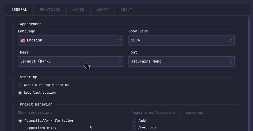 Theme selection interface showing available themes
Fonts
How Fonts Work
AiderDesk's font system is built on web fonts with CSS custom properties:
- Font Files: All fonts are included as TrueType (.ttf) files
- @font-face Declarations: Each font is properly declared in CSS for cross-browser compatibility
- CSS Variables: Fonts are applied using the
--font-familycustom property - Monospace Fallback: All fonts include
monospaceas a fallback for consistency
Available Fonts
AiderDesk includes 19 carefully selected fonts covering various styles:
Monospace/Code Fonts
- Sono - The default font, modern and highly readable
- JetBrains Mono - Developer-focused font with ligatures
- Roboto Mono - Clean, neutral monospace font
- Source Code Pro - Adobe's open-source coding font
- Space Mono - Quirky, distinctive monospace font
- Ubuntu Mono - Part of the Ubuntu font family
- Fira Code - Programming font with code ligatures
Sans-Serif Fonts
- Inter - Highly readable modern sans-serif
- Poppins - Geometric sans-serif with friendly appearance
- Nunito - Well-balanced sans-serif with rounded terminals
- Quicksand - Light, airy sans-serif font
- Space Grotesk - Modern geometric sans-serif
- Google Sans Code - Google's coding-optimized sans-serif
- Sansation - Clean, professional sans-serif
Serif & Display Fonts
- Lora - Elegant serif font suitable for long reading
- Playfair Display - High-contrast serif for headings
- Orbitron - Futuristic display font
- Enriqueta - Classic serif with modern proportions
- Silkscreen - Retro pixel-art style display font
Switching Fonts
- Open Settings from the main menu
- Navigate to the General section
- Under GUI Settings, select your preferred font from the dropdown
- The font applies immediately across the entire application
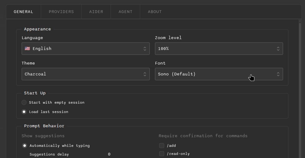 Font selection interface with live preview of each font
Contributing: Adding New Themes
Adding a New Theme
To contribute a new theme to AiderDesk, follow these steps:
1. Create the Theme SCSS File
Create a new file in src/renderer/src/themes/ following the naming convention:
// src/renderer/src/themes/theme-your-theme-name.scss
.theme-your-theme-name {
  // Background colors
  --color-bg-primary: #your-primary-bg-color;
  --color-bg-primary-light: #your-light-bg-color;
  --color-bg-primary-light-strong: #your-strong-bg-color;
  --color-bg-secondary: #your-secondary-bg-color;
  --color-bg-secondary-light: #your-secondary-light-bg-color;
  --color-bg-secondary-light-strongest: #your-secondary-strongest-bg-color;
  --color-bg-tertiary: #your-tertiary-bg-color;
  --color-bg-tertiary-emphasis: #your-tertiary-emphasis-color;
  --color-bg-tertiary-strong: #your-tertiary-strong-color;
  // ... continue with all background color variables

  // Text colors
  --color-text-primary: #your-primary-text-color;
  --color-text-secondary: #your-secondary-text-color;
  --color-text-tertiary: #your-tertiary-text-color;
  // ... continue with all text color variables

  // Border colors
  --color-border-default: #your-default-border-color;
  --color-border-accent: #your-accent-border-color;
  // ... continue with border colors

  // Interactive colors
  --color-button-primary: #your-primary-button-color;
  --color-button-primary-text: #your-primary-button-text-color;
  // ... continue with button colors

  // Status colors
  --color-success: #your-success-color;
  --color-warning: #your-warning-color;
  --color-error: #your-error-color;
  --color-info: #your-info-color;

  // Agent-specific colors
  --color-agent-auto-approve: #your-auto-approve-color;
  --color-agent-aider-tools: #your-aider-tools-color;
  --color-agent-power-tools: #your-power-tools-color;
  --color-agent-todo-tools: #your-todo-tools-color;
  --color-agent-context-files: #your-context-files-color;
  --color-agent-repo-map: #your-repo-map-color;
  // ... continue with agent colors
}
2. Import the Theme
Add your theme to the themes import file:
// src/renderer/src/themes/themes.scss
@use 'theme-your-theme-name.scss'; // Add this line
3. Update the Theme List
Add your theme to the TypeScript types:
// packages/common/src/types/common.ts
export const THEMES = [
  'dark',
  'light',
  'charcoal',
  // ... existing themes
  'your-theme-name', // Add this line
] as const;
4. Add Translation
Add your theme name to the translation files:
// packages/common/src/locales/en.json
{
  "settings": {
    "themeOptions": {
      "your-theme-name": "Your Theme Display Name"
    }
  }
}
5. Testing Requirements
Before submitting your theme, ensure it:
- ✅ Provides sufficient contrast for accessibility (WCAG AA standards)
- ✅ Works well in all major UI components
- ✅ Maintains readability in both light and dark contexts
- ✅ Includes all required color variables
- ✅ Is tested across different screen sizes
- ✅ Works with all available fonts
Theme Design Guidelines
- Contrast Ratio: Maintain at least 4.5:1 for normal text and 3:1 for large text
- Color Harmony: Use a cohesive color palette with proper relationships
- Consistency: Follow the established color hierarchy and naming conventions
- Accessibility: Ensure color combinations are accessible to colorblind users
- Performance: Use hex colors for optimal performance
Contributing: Adding New Fonts
Adding a New Font
To contribute a new font to AiderDesk, follow these steps:
1. Obtain the Font File
- Ensure you have the legal right to distribute the font (open-source license preferred)
- Obtain the font in TrueType (.ttf) format
- Verify the font includes all necessary characters and glyphs
2. Add Font File
Place the font file in the fonts directory:
src/renderer/src/fonts/YourFontName.ttf
3. Update Font CSS
Add the font declaration to the fonts CSS file:
/* src/renderer/src/fonts.css */
@font-face {
  font-family: 'YourFontName';
  src: url('./fonts/YourFontName.ttf') format('truetype');
  font-weight: 400;
  font-style: normal;
}
4. Update the Font List
Add your font to the TypeScript types:
// packages/common/src/types/common.ts
export const FONTS = [
  'Sono',
  'Poppins',
  // ... existing fonts
  'YourFontName', // Add this line
] as const;
5. Add Translation
Add your font name to the translation files:
// packages/common/src/locales/en.json
{
  "settings": {
    "fontOptions": {
      "yourFontName": "Your Font Display Name"
    }
  }
}
6. Testing Requirements
Before submitting your font, ensure it:
- ✅ Renders correctly across all operating systems
- ✅ Maintains readability at various sizes
- ✅ Works well with all available themes
- ✅ Includes proper character coverage for your target languages
- ✅ Has reasonable file size (< 1MB preferred)
- ✅ Is properly licensed for open-source distribution
Font Selection Guidelines
- Readability: Prioritize fonts that are easy to read for long periods
- Character Support: Ensure coverage of common programming characters and symbols
- Performance: Consider font file size and loading impact
- Licensing: Prefer fonts with permissive open-source licenses (MIT, OFL, Apache)
- Variety: Add fonts that bring unique styles and use cases
Recommended Font Sources
- Google Fonts: Large collection of free, open-source fonts
- Adobe Fonts: High-quality fonts (check licensing)
- Font Squirrel: Curated collection of free fonts
- GitHub: Many open-source font projects available
Troubleshooting
Theme Issues
If you encounter issues with themes:
- Theme not applying: Check that the theme file is properly imported in
themes.scss - Colors not working: Verify all required CSS variables are defined
- Contrast issues: Use browser dev tools to check contrast ratios
- Missing elements: Ensure all color variables from the reference theme are included
Font Issues
If you encounter issues with fonts:
- Font not loading: Check the font file path in the
@font-facedeclaration - Font not appearing: Verify the font name matches exactly in CSS and TypeScript
- Rendering issues: Test the font across different browsers and operating systems
- Licensing concerns: Double-check the font's license allows for distribution
Best Practices
For Users
- Consistency: Choose a theme and font combination that you'll use consistently
- Accessibility: Prioritize readability and contrast over aesthetics
- Environment: Consider your lighting conditions when choosing between light and dark themes
- Performance: Lighter themes may consume slightly less battery on OLED displays
For Contributors
- Testing: Thoroughly test your contributions across different environments
- Documentation: Provide clear descriptions of your theme/font design philosophy
- Maintenance: Be prepared to maintain your contribution over time
- Community: Engage with user feedback and make improvements based on usage
By following these guidelines, you can help make AiderDesk more customizable and enjoyable for everyone in the community.